
Livefyre Engagement Cloud
Real moments make brands better. Livefyre’s platform helps brands and publishers harness user-generated content from across the web, turning it into meaningful digital experiences to engage their fans.


Redefining Brand Engagement
I had the opportunity to redesign our brand and product storytelling, a months-long process of buy-in, strategy, mood boarding, design exploration, and final execution, overseeing a multidisciplinary team on design, copywriting, animation, and development.
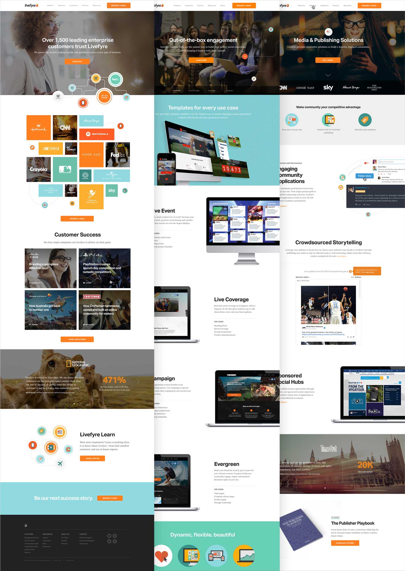
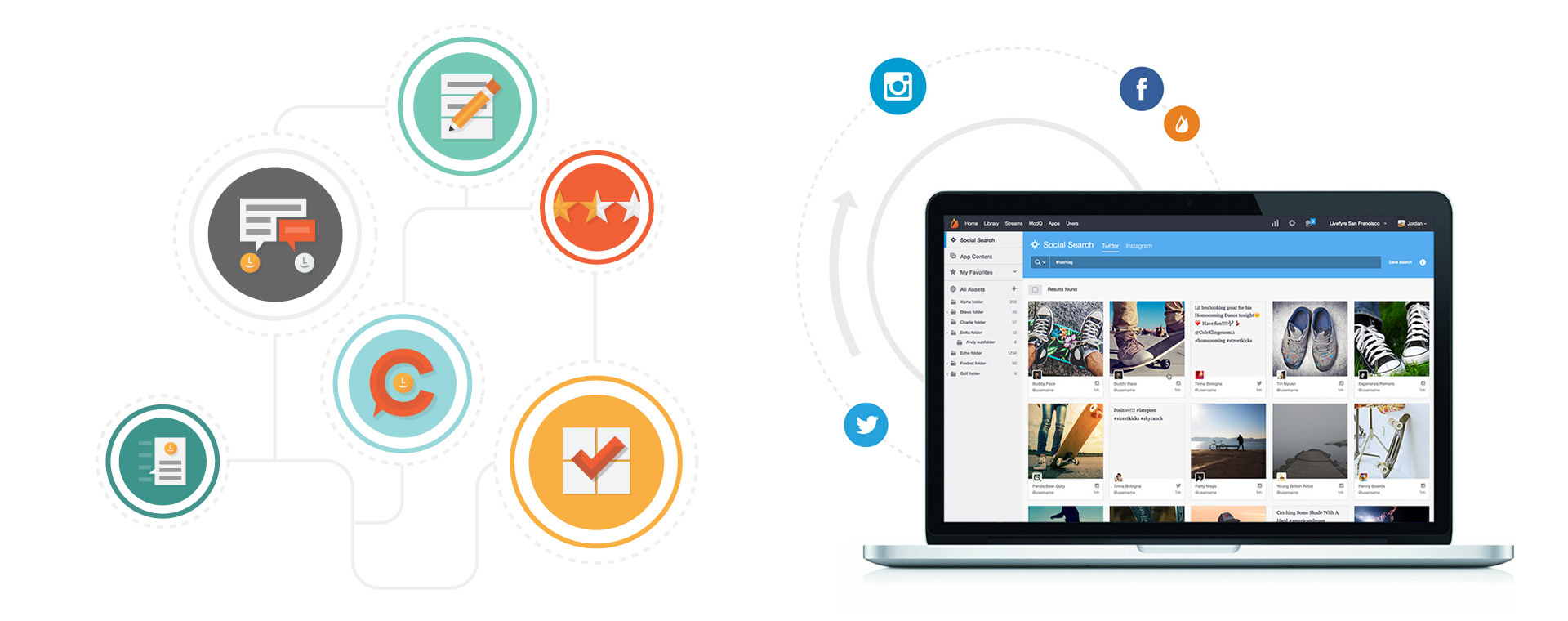
The new brand brought to life the concept of engagement and human connection through vibrant colors, playful iconography, illustration and honest photography. It blends the simplicity of great moments of engagement with the complex inner workings of the Livefyre platform that make these moments possible.

Our website became one of our most important brand touch points. Every page of our site was built to be fully responsive across all devices using a bootstrap grid. It was also important for us to add movement throughout the new website using video backgrounds, gifs and css animations.
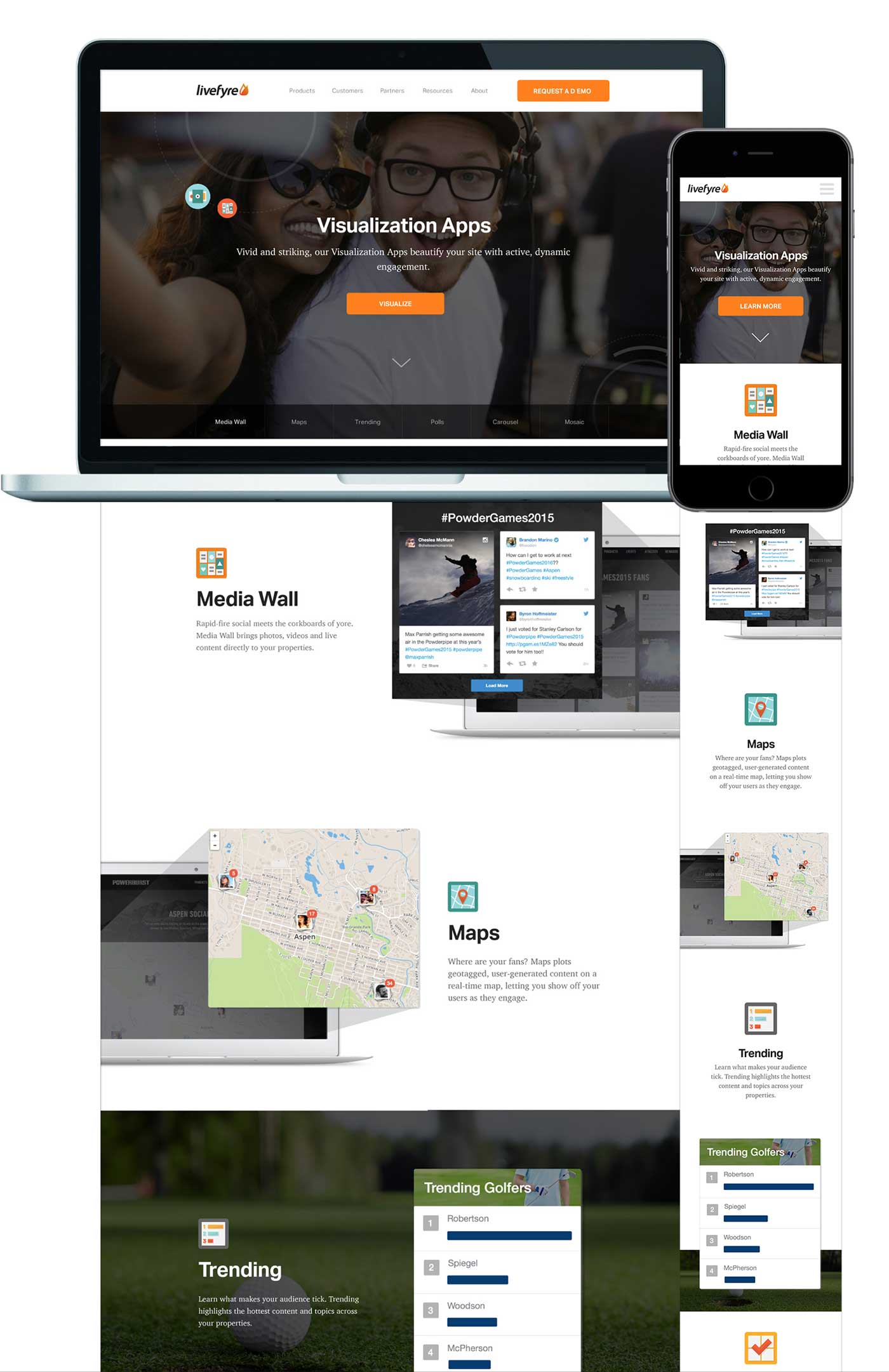
We collaborated with Fuzzco to create our iconography system, representing our apps, workflows and audiences.

Building Our Marketing Engine
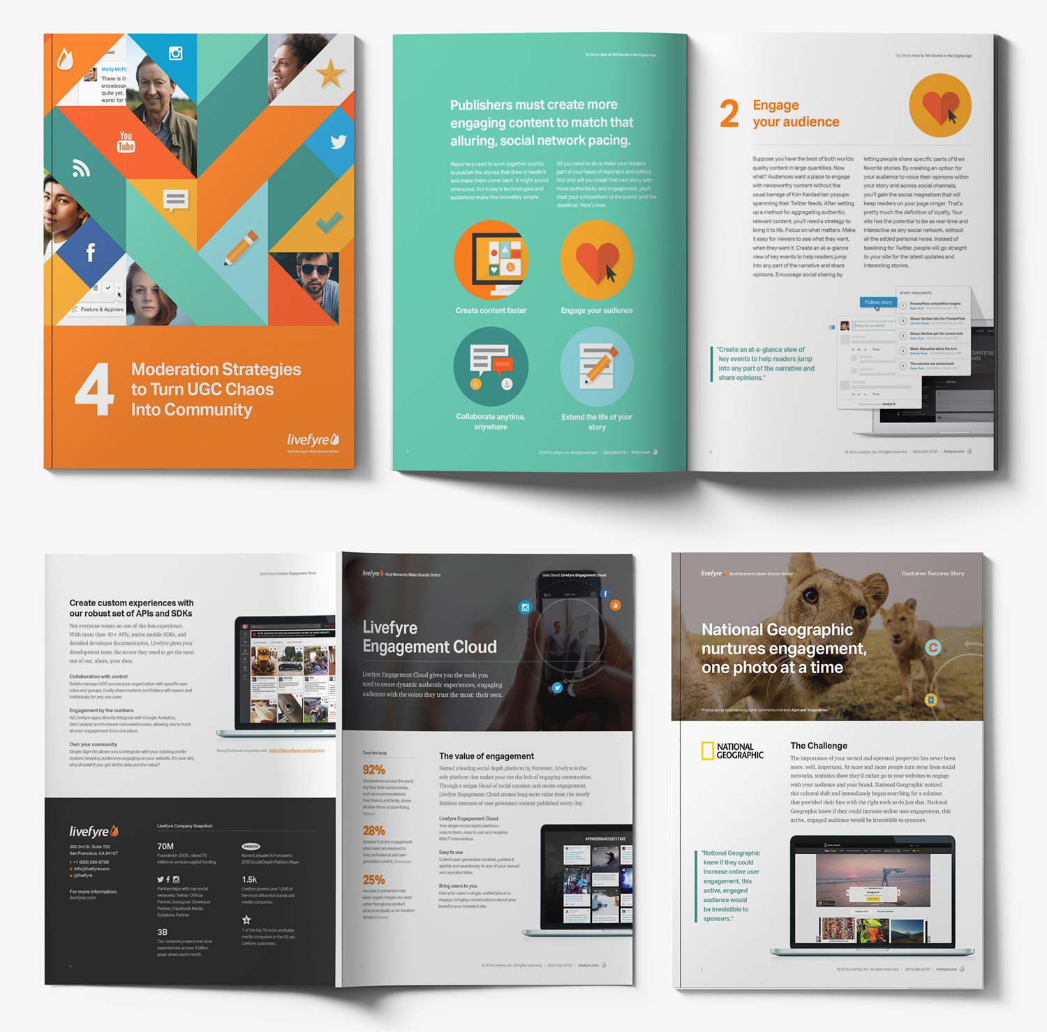
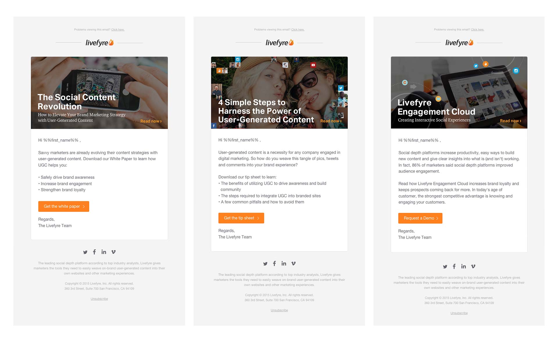
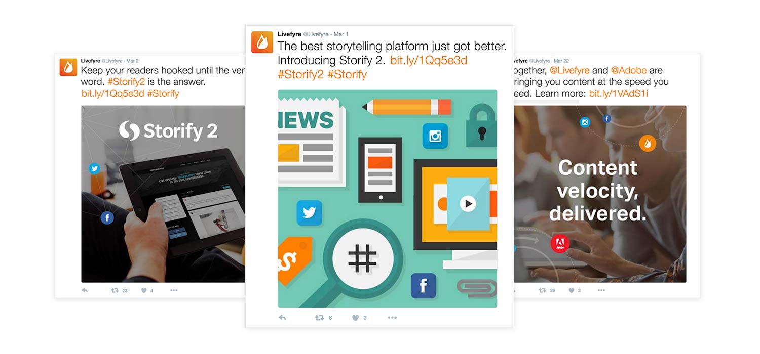
As any enterprise software company knows, content marketing is a crucial part of the marketing engine. We adapted our brand to numerous pieces including data sheets, tip sheets, white papers, and customer success stories, and distributed these through email nurture campaigns as well as through social channels.
Introducing Ourselves to the World
We launched an outdoor and digital ad campaign to boost our new platform announcement on billboards across major cities in the US and held a launch event in New York City to bring customers, prospects and thought leaders—including Spike Lee—together to explore the future of social engagement.


Extending Our Brand
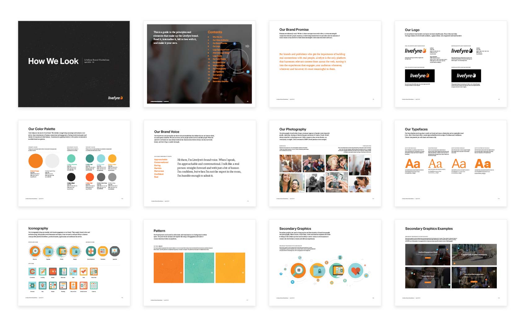
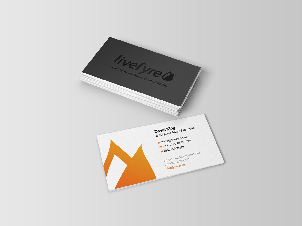
We extended the brand through everything from business cards to a branded logo bumper, which served as the introduction to all of our video content and tutorials. Our brand guidelines became a reference point for multiple departments to shepherd the brand in their own work.
The entire team and our stakeholders were very proud of the final product and happy to finally see consistency and clarity across all of our brand messaging. As a result of our redesign, we saw conversions from our website double, and our first ever outdoor ad campaign drove the biggest quarter of the year, a 20% growth from the previous quarter.
This was my first time leading a major brand redesign, and it was an amazing learning experience for me as a new Creative Director. Here are some takeaways that I wanted to share:
Executive buy-in is crucial. Help your stakeholders understand the purpose of the redesign and bring them along in the journey.
Its ok to start small. Put a stake in the ground on a few key brand elements and build from there.
Working with external vendors is hard. Its important to know what you want and don’t shy away from being more hands on.
Expect change. You won’t know the full extent of your brand applications and limitations until you put it into practice.
Continually add to your guidelines as you learn more about your brand over time.
Team:
Creative Director: Michelle Haft
Senior Designer: Amy Li
Designer: Hilary Liu
Copywriter: Frank Morgan
Project Management: Aimee Lowry
Development: Jon Cianciullo, Cid Donham, Desmond Liang
Illustration/Iconography: Fuzzco
Outdoor Campaign: Gravitate
